Product Content Type
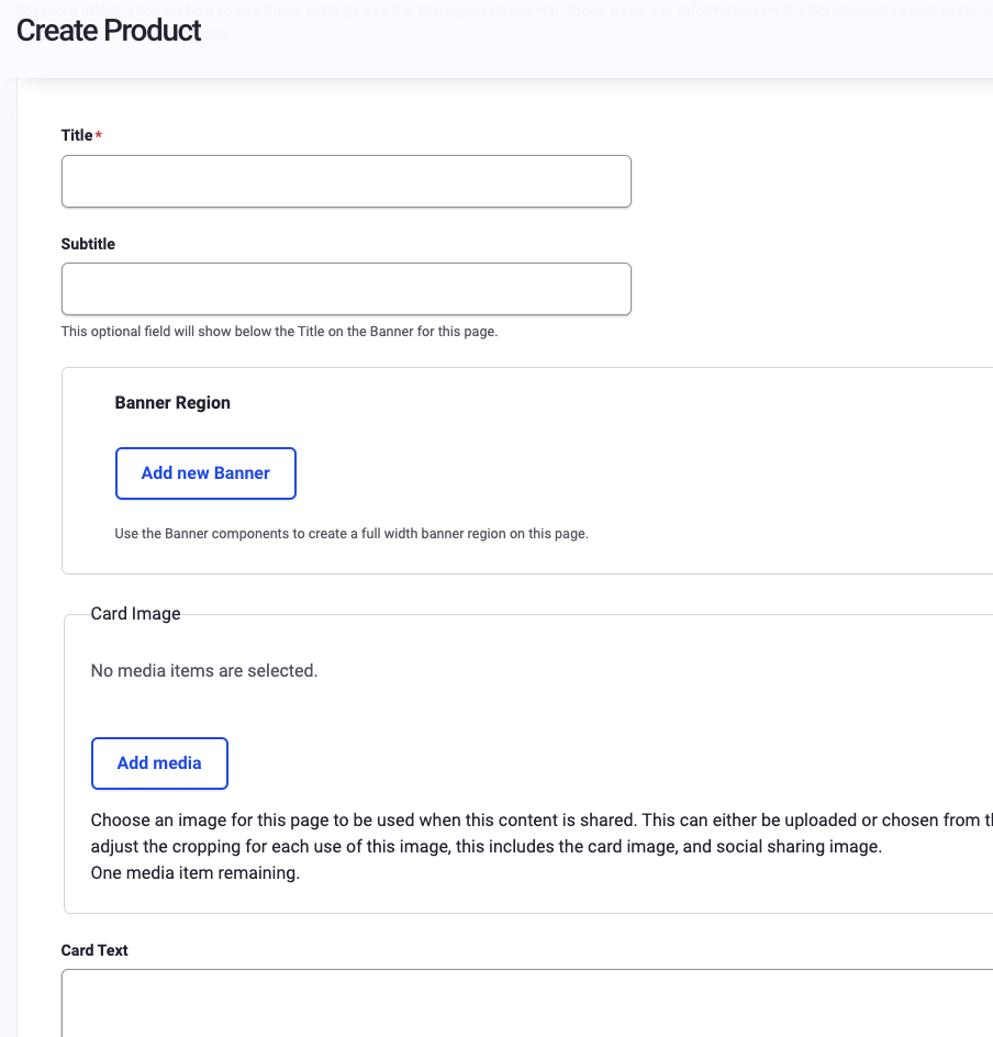
The Product Page provides a way to separate out, organize and share specific Products that are offered. To add a new Product Page go to Content>Add Content>Product. The initial form provided will also allow you to enter the site details and status for the new page; including its title, Menu link, URL, Metatags, and Publishing status.
Explanation of fields within the Product Page:
- Title - This required field is the main title for this page. It will also be used as the main Header for this page, in the Menu link, and the page URL.
- Subtitle - An optional field that will show below the Title if you add a Banner Image to this page. (Example: Title = "What We Do", Subtitle = "Building a Responsible Future - Together")
- Banner Region - Allows you to add and crop a Banner Image that will be displayed just below the Header and main menu on your new page.
- Card Image/Text - Enter representative text and an image to be displayed within a card on other pages within the site. The Card Image can be cropped and reused/added as the Sharing Image, and the text may be reused as well.
- Sharing Image/Text - This image and text will be used when this page is shared on social media, and you have the option to provide same/different content than what was provided in the card image and card text if you choose.
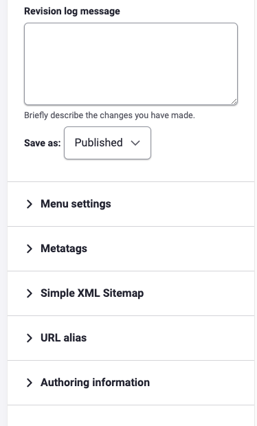
- Content Settings - This section covers the Published status, the Menu Settings, URL redirects, page Authoring Information, and Promotion Options of the page.
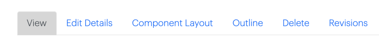
Once you're done providing the basic information for your page, save your work, and you are ready to start building your content by clicking on the "Component Layout" Tab. Details of how to layout your content with custom blocks can be found on the Component Layout System page in the handbook.