Adding Text Block Component to a Page
Text Block Components are a useful tool for organizing large amounts of text on your site. This editor, much like Microsoft Word or Apple Pages, allows you to format text, lists, tables and other media into complex 'Magazine' style layouts by using font styles, formats and media embedding. You can either use this field to create your content directly or you can paste in your content and then style it to your liking.
**Important Note: when pasting from another program, paste the text in, then select it all (Select All button) and click the Remove Format button. You can then restyle the text as needed. This may seem troublesome or more difficult but it is very important to avoid any major design malfunctions and to keep your content in line with your themes branding. Microsoft Word especially likes to add font styles that can cause your site design to completely break.**
Create Text Block Layout
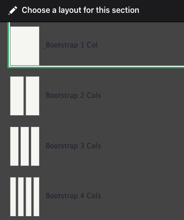
To create a Text Block on a page, navigate to the "Component Layout" tab and scroll down to "Add Section". Choose the type of Layout you would like to see for your new Text Block, and if you would like any background color.
The Component Layout System handbook page can help further guide you in creating the physical layout of the "Custom Block" if needed.
Once you have added your new Component section to your page, choose the block type to add from the dropdown. In this case we are choosing the "Text Block".
Add Text Block
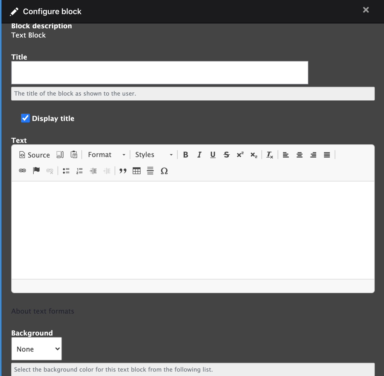
A new window will open to allow you to customize your block by adding a Title (uncheck the box "Display title" if you don't want it to display it on the page), text/content and a background color for your block.
Let's go through each button and its basic function. To see the buttons name, hover your mouse over it for a few second. For more advanced buttons such as the File Browser(IMCE) we will explain in detail in a separate tutorial. Starting from the Top Left and moving right:

- Source - when you click this button you will see the actual HTML the editor is generating for you. While it is not necessary to know any coding, having basic HTML knowledge may help you do more advanced styling and help you clean up any aberrant layouts. This button toggles between Source/Code view and Editor view.
- Show Blocks - this will highlight and show the bounding boxes for the content. Useful to see what kind of bounding element is being used.
- Paste as plain text - paste the content from the clipboard but remove all formatting and styling. This is useful for pasting from other programs or other browser windows.
- Format - this allows you to apply preconfigured paragraph styles to your content. This works in conjunction with your sites theme to style your content correctly. Much like the Styles in a word processor you can use this to give your content structure; using Headers and Paragraphs.
- Styles - this gives you additional paragraph styles to choose from.
- Bold, Italic, Underline & Strikethrough - these standard styling buttons create simple text formatting.
- Subscript/Superscript - these styles will apply the subscript or superscript format to the selected text; useful for annotations or footnotes.
- Remove Format - this will remove all the formatting on the content, this is useful for content copied from other programs that still have styling and/or formatting. Use the Select All and then Remove Format to keep your content but remove undesired styling.
- Align Left, Center, Align Right, and Justify - this formats the alignment for the text and media.
- Link, Anchor, and Unlink - create a link using the selected text or image. There are several options available to work best for the user and Search Engines.
- Unlink - remove a link from text or media.
- Anchor - use this to create an 'Anchor point' in the page that you can then link to using the link button. This allows you to create quick jump points the user can use to move quickly through long pages.
- See below for more on using the Link Dialog.
- Insert Numbered or Bulleted List - to create functional lists such as this one, use these buttons. You can create a list hierarchy with full parent/child relationships. Lists can be either numeric or bulleted.
- Decrease Indent and Increase Indent - use these buttons to inset both paragraph text and list hierarchies. For instance to create a list with three child list items, select those children and click Increase Indent. Those items will now be indented below the parent item, and their numbers or bullets will be updated.
- Block Quote - this style applies the quoted text format to the selected text, this indents and highlights the text.
- Table - this dialog lets you create an HTML Table for tabled data. Do Not use this to create formats on the page; this will actually result in Search Engine penalization. Use this for only information that should be shown in a table.
- Insert Horizontal Line - this creates the <hr> html tag which creates a styled line across the page.
- Insert Special Character - for special characters such as Copyright or Trademark use this dialog to use the correct unicode for those characters.
Once you have composed and formatted your text, choose the background color for your text block. "None" will leave the background white, or you can choose light gray. Click "Add Block" to return back to the Component Layout page to preview what you have created. If you are satisfied with the end product scroll up to click the "Save Layout" button.
Creating Links
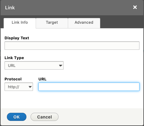
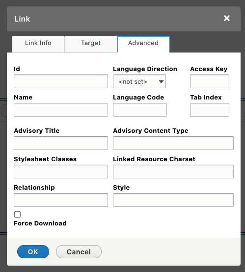
When you open the link window you will get the Link form.
Link info tab - set the type of link you want to create, from standard link (URL) to Email links. You can select the 'Protocol' if its not the standard http://. For instance you want to link to a secure page on another site you can select https://.
- Internal path lets you link, via an autocomplete field, to pages on your site.
- The URL field will link to pages on the internet including those on your site. The Browse Server button will allow you to link to media on your server, this will open the File Browser (IMCE). For instance to link to a PDF file, open the File Browser, upload the PDF to your server and select it as the link. When the user clicks this link they will download (or view depending on the browser) the PDF or other media file.
- Link to anchor in the text lets you choose an Anchor you have previously created using the Anchor button.
- E-mail creates a standard email link with placeholder text already filled out.
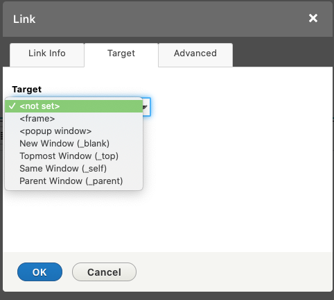
Target Tab - if you are linking to content on this site, or media from this site you can safely ignore this tab. However, if you are linking to content off your site it might be good to select 'New Window (_blank)'. This will cause the link to open in a new window or tab when clicked while leaving your site page still open.
Advanced Tab - for the most part you can ignore this tab unless you are familiar with advanced settings for HTML <a> tags. However, there are a few use cases that you should use this for.
One use case would be when you are creating links off your site that fall under the following conditions you should use the 'relationship' field and enter 'nofollow'.
- Paid links, text link ads, banner ads, or any link that you don't want the search engines to believe you endorse should always use rel="nofollow".
If you know and trust the other website and recommend that your users visit that website, then there is no reason to add rel="nofollow". In fact, there's reason to believe that linking to other quality websites that are related to yours will actually improve your rankings. So don't be stingy with links! On the other hand, if you don't know or trust the other website, or if you are using it as a negative example of something your users should avoid, then definitely do use rel="nofollow".
Example Title One
This is a three column layout page. You can format how you want your three columns to look on the page in Layout Builder.
Example Title Two
- Things to remember are that you have bullet lists
- Ways to link inside and outside of the site
-
Style your text how you would like it to look
Example Title Three
You can also provide a different color for the background on your text.
Text Editor Styles
The Text Editor not only allows you to choose the HTML tag, it also provides a drop for adding styles to those tags. That way you can still create valid structured content but adjust the look and feel as needed. This is a list of all the styles available for each tag type. To apply these styles click into the content you want to update the style on (you don't need to highlight it) and select the style. The Editor will only apply the style to the specific HTML tag. For instance the H2 Header - Bold Red will only work on the H2 HTML tag.
H1 Header - No Style
H1 Header - Reduced
H1 Header - Subhead
H2 Header - No Style
H2 Header - Reduced
H2 Header - Subhead
H2 Header - Bold Red
H2 Header - Regular Red
H2 Header - Quote Red
H3 Header - No Style
H3 Header - Reduced
H3 Header - Subhead
H3 Header - Red Box
H4 Header - No Style
H5 Header - No Style
H6 Header - No Style
Regular Paragraph text Sed porttitor lectus nibh. Mauris blandit aliquet elit, eget tincidunt nibh pulvinar a. Praesent sapien massa, convallis a pellentesque nec, egestas non nisi. Sed porttitor lectus nibh. Nulla porttitor accumsan tincidunt.
Paragraph Footnotes - Sed porttitor lectus nibh. Mauris blandit aliquet elit, eget tincidunt nibh pulvinar a. Praesent sapien massa, convallis a pellentesque nec, egestas non nisi. Sed porttitor lectus nibh. Nulla porttitor accumsan tincidunt.
Paragraph Bold Footnotes - text Sed porttitor lectus nibh. Mauris blandit aliquet elit, eget tincidunt nibh pulvinar a. Praesent sapien massa, convallis a pellentesque nec, egestas non nisi. Sed porttitor lectus nibh. Nulla porttitor accumsan tincidunt.
Paragraph Red Box sentence. Mauris blandit aliquet
Paragraph Drop Cap - Sed porttitor lectus nibh. Mauris blandit aliquet elit, eget tincidunt nibh pulvinar a. Praesent sapien massa, convallis a pellentesque nec, egestas non nisi. Sed porttitor lectus nibh. Nulla porttitor accumsan tincidunt. Sed porttitor lectus nibh. Mauris blandit aliquet elit, eget tincidunt nibh pulvinar a. Praesent sapien massa, convallis a pellentesque nec, egestas non nisi. Sed porttitor lectus nibh. Nulla porttitor accumsan tincidunt. Sed porttitor lectus nibh. Mauris blandit aliquet elit, eget tincidunt nibh pulvinar a. Praesent sapien massa, convallis a pellentesque nec, egestas non nisi. Sed porttitor lectus nibh. Nulla porttitor accumsan tincidunt.
Regular Paragraph text Sed porttitor lectus nibh. Mauris blandit aliquet elit, eget tincidunt nibh pulvinar a. Praesent sapien massa, convallis a pellentesque nec, egestas non nisi. Sed porttitor lectus nibh. Nulla porttitor accumsan tincidunt. Regular Paragraph text Sed porttitor lectus nibh. Mauris blandit aliquet elit, eget tincidunt nibh pulvinar a. Praesent sapien massa, convallis a pellentesque nec, egestas non nisi. Sed porttitor lectus nibh. Nulla porttitor accumsan tincidunt. Regular Paragraph text Sed porttitor lectus nibh. Mauris blandit aliquet elit, eget tincidunt nibh pulvinar a. Praesent sapien massa, convallis a pellentesque nec, egestas non nisi. Sed porttitor lectus nibh. Nulla porttitor accumsan tincidunt.
Regular Paragraph text Sed porttitor lectus nibh. Mauris blandit aliquet elit, eget tincidunt nibh pulvinar a. Praesent sapien massa, convallis a pellentesque nec, egestas non nisi. Sed porttitor lectus nibh. Nulla porttitor accumsan tincidunt. Regular Paragraph text Sed porttitor lectus nibh. Mauris blandit aliquet elit, eget tincidunt nibh pulvinar a. Praesent sapien massa, convallis a pellentesque nec, egestas non nisi. Sed porttitor lectus nibh. Nulla porttitor accumsan tincidunt. Regular Paragraph text Sed porttitor lectus nibh. Mauris blandit aliquet elit, eget tincidunt nibh pulvinar a. Praesent sapien massa, convallis a pellentesque nec, egestas non nisi. Sed porttitor lectus nibh. Nulla porttitor accumsan tincidunt.
Regular Paragraph text Sed porttitor lectus nibh. Mauris blandit aliquet elit, eget tincidunt nibh pulvinar a. Praesent sapien massa, convallis a pellentesque nec, egestas non nisi. Sed porttitor lectus nibh. Nulla porttitor accumsan tincidunt.
Regular Paragraphred superscript text Sed porttitor lectus nibh. Mauris blandit aliquet elit, eget tincidunt nibh pulvinar a. Praesent sapien massa, convallis a pellentesque nec, egestas non nisi. Sed porttitor lectus nibh. Nulla porttitor accumsan tincidunt.
Regular Unordered List
- Sed porttitor lectus nibh. Mauris blandit aliquet elit, eget tincidunt nibh pulvinar a.
- Praesent sapien massa, convallis a pellentesque nec, egestas non nisi.
- Sed porttitor lectus nibh. Nulla porttitor accumsan tincidunt.
Regular Ordered List
- Sed porttitor lectus nibh. Mauris blandit aliquet elit, eget tincidunt nibh pulvinar a.
- Praesent sapien massa, convallis a pellentesque nec, egestas non nisi.
- Sed porttitor lectus nibh. Nulla porttitor accumsan tincidunt.
Red Dot Ordered List
- Sed porttitor lectus nibh. Mauris blandit aliquet elit, eget tincidunt nibh pulvinar a.
- Praesent sapien massa, convallis a pellentesque nec, egestas non nisi.
- Sed porttitor lectus nibh. Nulla porttitor accumsan tincidunt.
Footnote Ordered List
- Sed porttitor lectus nibh. Mauris blandit aliquet elit, eget tincidunt nibh pulvinar a.
- Praesent sapien massa, convallis a pellentesque nec, egestas non nisi.
- Sed porttitor lectus nibh. Nulla porttitor accumsan tincidunt.
Bold Footnote Ordered List
- Sed porttitor lectus nibh. Mauris blandit aliquet elit, eget tincidunt nibh pulvinar a.
- Praesent sapien massa, convallis a pellentesque nec, egestas non nisi.
- Sed porttitor lectus nibh. Nulla porttitor accumsan tincidunt.
Responsive Tables
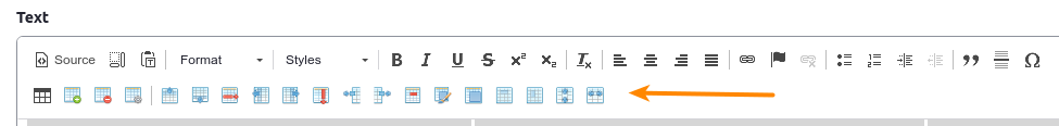
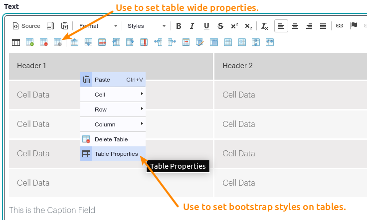
The text editor provides for advanced table functionality using the various table buttons. These buttons allow the creation of tables, and manipulation of the rows, columns, and cells. Additionally the table properties can be used to add several Bootstrap Responsive table styles so that the tables can have enhanced visual styles. Most of the buttons are fairly self evident with the exception of the duplicate Table buttons. These 2 buttons are basically the same however the first one is the default add Table button that provides the Bootstrap classes, while the second button gives more advanced tools for adding tables. You can use either button to create the table, then you can update the Table properties one of two ways.
Table Properties & Styles
In order to provide the correct Bootstrap style classes the editor required 2 different table property settings.
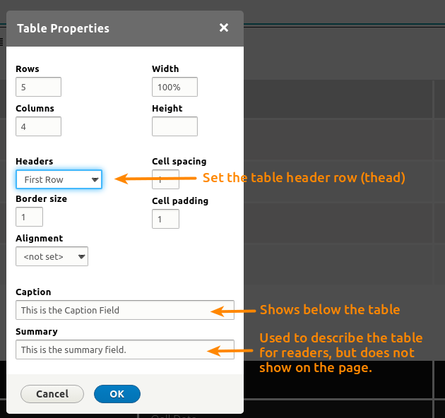
- The first and more advanced setting provided by the Table Toolbar should be used to set the table size, table header settings, caption and summary. To use this setting click anywhere within the table, then click the Table Properties button (4th from the left). The caption will appear below the table like an image caption. The summary is used to describe the table within the code only, it will not show on the page but is set as the summary attribute on the table.
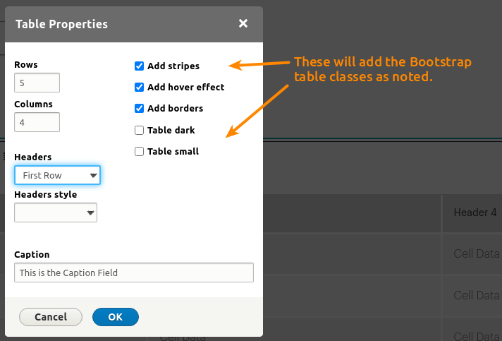
- The second method is only useful for adding the various Bootstrap style classes. This sets the Responsive setting, table border, table striping, table hover effect, and table size. To use these setting right click anywhere in the table, then use the checkboxes as needed.
Note: in order to set the initial responsive styles you will need to set at least one of the checkboxes. The add Borders checkbox is a good one to use as it has little style of its own, but will trigger the full Responsive table style. To keep the responsive table styles but not show other styles you can then uncheck all boxes.
Example Standard Table
| Header 1 | Header 2 | Header 3 | Header 4 |
|---|---|---|---|
| Cell Data | Cell Data | Cell Data | Cell Data |
| Cell Data | Cell Data | Cell Data | Cell Data |
| Cell Data | Cell Data | Cell Data | Cell Data |
| Cell Data | Cell Data | Cell Data | Cell Data |
Example Striped Table with Hover
| Header 1 | Header 2 | Header 3 | Header 4 |
|---|---|---|---|
| Cell Data | Cell Data | Cell Data | Cell Data |
| Cell Data | Cell Data | Cell Data | Cell Data |
| Cell Data | Cell Data | Cell Data | Cell Data |
| Cell Data | Cell Data | Cell Data | Cell Data |
Example Dark Table with Hover
| Header 1 | Header 2 | Header 3 | Header 4 |
|---|---|---|---|
| Cell Data | Cell Data | Cell Data | Cell Data |
| Cell Data | Cell Data | Cell Data | Cell Data |
| Cell Data | Cell Data | Cell Data | Cell Data |
| Cell Data | Cell Data | Cell Data | Cell Data |
Example Small Dark Table with Hover
| Header 1 | Header 2 | Header 3 | Header 4 |
|---|---|---|---|
| Cell Data | Cell Data | Cell Data | Cell Data |
| Cell Data | Cell Data | Cell Data | Cell Data |
| Cell Data | Cell Data | Cell Data | Cell Data |
| Cell Data | Cell Data | Cell Data | Cell Data |
Table Properties & Buttons