List Content Component
Use this dynamic component to create lists of content that can be shown as full width ordered lists, accordions, or as tabbed groups. In each group you have the option to display Text, Number, or Image Items in various layouts and combinations.
Adding List Content
The List Content Component is in essence a container for you to create lists of information and visual content in one area of a page. This items are made up of 3 different types of content and you can add as many as you want of each:
- Image Items - Insert an Image with text to be part of the list.
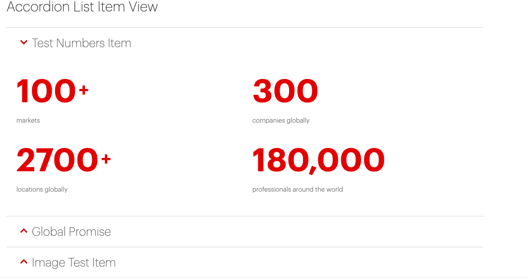
- Numbers Item - This creates bold red styled numbers with optional suffixes and small text for providing further info under the number.
- Text Item - Allows you to create 1-2 column layouts of text as part of your list.
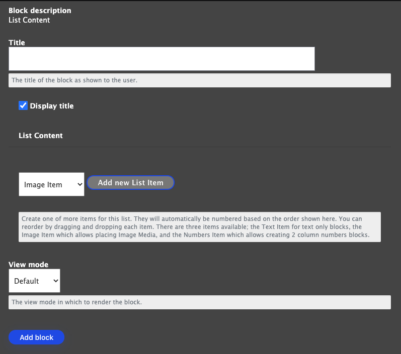
Adding an Image Item
Choose Image item from the dropdown item, and you will be asked to enter the following information
- Description for this Block of information.
- Add Media of an Image or Logo
- Optional text to be seen under your image on the list item.
Complete the task by clicking "Create List Item".
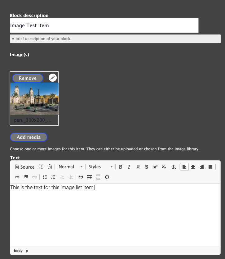
Adding a Numbers Item
The Numbers Item can be built out to be shown in multiple ways. Note that you can add up to 4 numbers items in one. Each Number Item comes with the following fields so you can enter an array of different combinations:
- Number - The number entered will be formatted in large red bold styling
- Suffix - On the current site, the most commonly used suffix is "+" next to the number, but you can create super/sub script items too with the help of suffix alignment. These will also be displayed in bold red styling
- Suffix Alignment - Set if you want the suffix alignment to be top, center or bottom.
- Text - Type in any information you want to give about the number to label it as needed, this displays very small under the number.
Click the next number item to continue adding up to 4 items, and then click "Create List Item" when you are finished.
Adding a Text Item
The text list item allows you to do up to two columns of text within each item and add footer text as needed. Type the text you want displayed and it will be formatted correctly for you once you complete the task by adding "Create List Item"
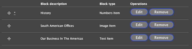
Arrange Your List Items
Note that once you have multiple List Items built out that you have the ability to grab and drag them to arrange the order however you want it displayed.
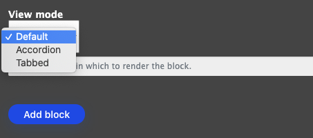
View Mode
Before you click "Add Block" to finish adding your List Item block, you can choose the view mode for your list.
- Default - This view provides a numbered list of your items left to right down the page.
- Accordion - This creates a stacked view with an arrow to click into the list content.
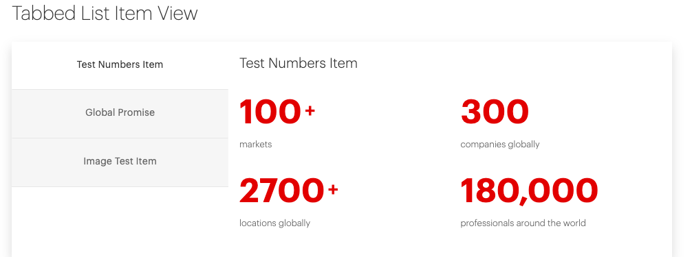
- Tabbed - A window displays the list items with tabs on the left for navigating the content.
Below are examples of each View Mode.
Default View of List Content
-
Text Item
Proin eget tortor risus. Mauris blandit aliquet elit, eget tincidunt nibh pulvinar a. Curabitur arcu erat, accumsan id imperdiet et, porttitor at sem. Nulla porttitor accumsan tincidunt. Cras ultricies ligula sed magna dictum porta.
-
Image Item

-
Number Item
100 +Things95 %Functionality1200 years100 thpositionPostscript text for footnotes and such. -
Text Item Complex
Vestibulum ante ipsum primis in faucibus orci luctus et ultrices posuere cubilia Curae; Donec velit neque, auctor sit amet aliquam vel, ullamcorper sit.
amet ligula. Nulla porttitor accumsan tincidunt. Vivamus magna justo, lacinia eget consectetur sed, convallis at tellus. Donec rutrum congue leo eget malesuada.