Content Carousel Component
The content carousel component is a full-width carousel with an image on the left and text on the right.
Create the Section
Find detailed instructions on how the component layout system works here
- Navigate to the Component layout tab.
- Scroll down and select add new Section.
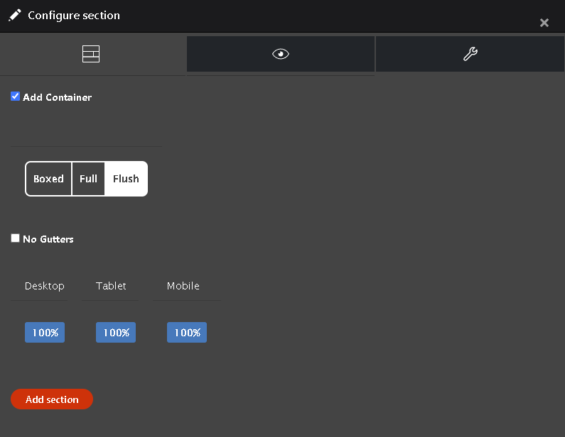
- Create a single column, check "Add Container", Select flush, and make everything 100%
- Then move on to the style tab with the eye logo. Choose the "Row padding none" in the padding style dropdown.
- Lastly click the "Add Section" button.
Add the Content Carousel Component
- Inside the section choose "Add Content Carousel" from the drop-down.
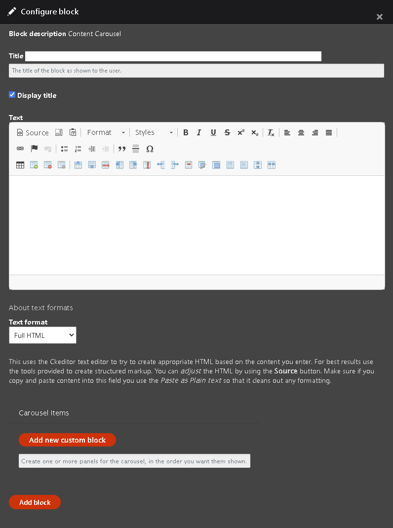
- The configure block window should open from the side
- Add a title. You can choose to show or hide the title by checking or unchecking the display title box
- The text field is optional
- Now select "Add new custom block"
Create the Carousel item
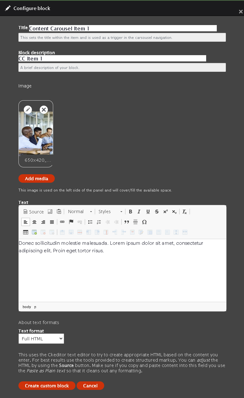
- Fill out the Title
- Fill out the Block description
- Add an image
- Insert text
- Once those are finished you can click the "Create custom block" button
- Repeat as needed
Save Layout
Once you have finished the Carousel and click the " Add block" button you will be taken back to the layout builder. Scroll up and select Save Layout.
Example Content Carousel

Curabitur aliquet quam id dui posuere blandit. Vivamus magna justo, lacinia eget consectetur sed, convallis at tellus. Vivamus magna justo, lacinia eget consectetur sed, convallis at tellus.

Sed porttitor lectus nibh. Vestibulum ac diam sit amet quam vehicula elementum sed sit amet dui. Curabitur arcu erat, accumsan id imperdiet et, porttitor at sem.

Nulla quis lorem ut libero malesuada feugiat. Vestibulum ante ipsum primis in faucibus orci luctus et ultrices posuere cubilia Curae; Donec velit neque, auctor sit amet aliquam vel, ullamcorper sit amet ligula. Quisque velit nisi, pretium ut lacinia in, elementum id enim.