Creating Content Cards
Content Cards are a versatile way to provide multiple types of media and information to the visitors of your website. Once you create a card it can be reused anywhere on the site in the future.
Adding Content Card(s) to a Page
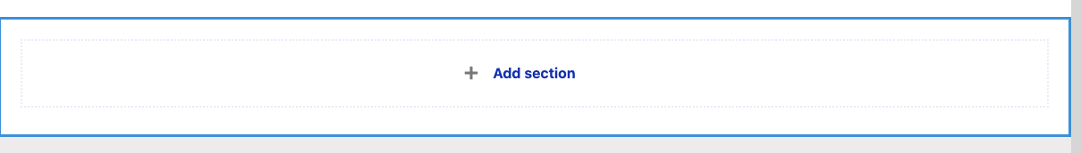
To start adding card(s) to a page, go to the "Component Layout" tab, and then click to "+ Add Section". The Layout Builder window will open to the right so you can choose the proper format to add your cards.
A Few Tips to Note:
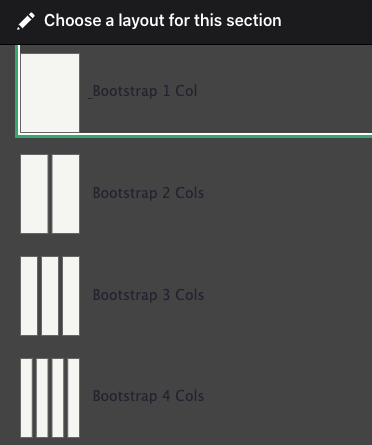
- A single Content Card being added to a page will look best if it is in a desktop format no larger than 50%.
- To add multiples of Content Cards to a page, choose 100% for all three layout options (Desktop, Tablet, and Mobile) and add as many cards as you need, the formatting will be automatic.
Please check our Component Layout page if you need to better understand how Layout Builder works.
Configuring your Content Cards Block
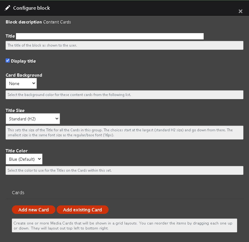
To setup your content cards block you will need to work through the following info:
- Title - Add your title.
- Check the box whether or not you want this series of content cards to have this displayed.
- Choose the background color for all of your cards.
- Select a title size. There is help text under the drop-down for more information.
- Choose the color for the Card Title (different from the block title)
- Click "Add New Card" to begin
Adding a NEW Card Block
Adding a NEW Card block will require you to decide on what you would like your card to display.
To setup your new block you'll need to enter the following information
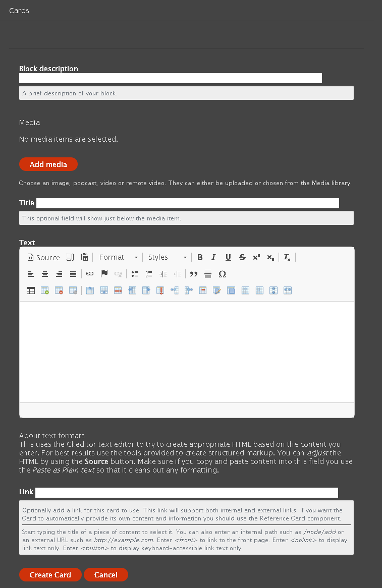
- Block Description - So you can find your card easily in custom block library.
- Add Media - You have the option to add an Image, Video, podcast or Remote Video to this card.
- Title - This is an option field that will display on your card if you enter info in here. The color of this title will depend on what you chose above.
- Text - This is optional and will be displayed below the media item.
- Link - You can enter a link that is internal to the site or external to another site here.
- Internal Use Case - this allows you the flexibility to have a card referencing an internal page alongside other Content Cards.
- External Use Case - you can link to relevant information that isn't housed on this website.
- Once you have filled out all desired and required sections click create card.
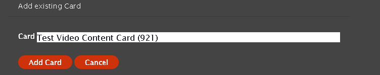
Add Existing Card
Adding an existing Card Block is very simple, and can be done by just clicking the "Add Existing Card". When you start typing you should see a drop-down of available cards to choose from. Once you have selected your card you should see its name fill in the text field. You can now click "Add Card" and then move on to adding your next card. You can add as many as you would like and the formatting will take care of how they are laid out.
Maximum Columns & View Mode
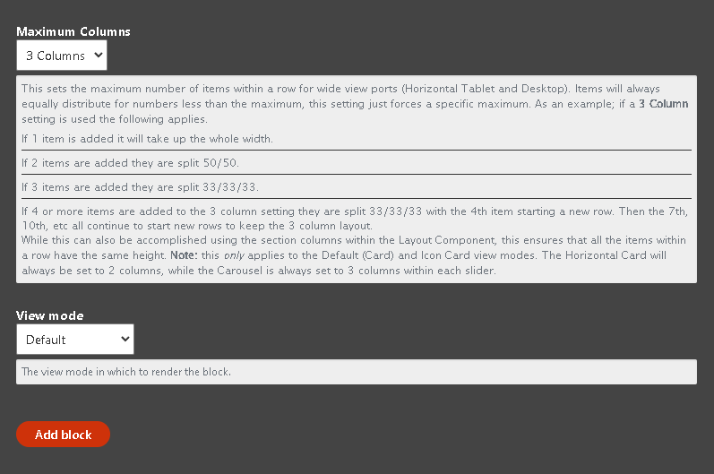
Maximum Columns
The Content Card(s) supports setting a maximum column number. See the help text for that setting. This allows you to set the total number of columns per row regardless of the number of cards added to the component. These will always collapse down to 100% on mobile devices. Note also that if you select the 4 Column maximum but only upload 2 or 3 items the columns will automatically lay out equally. This must sets when the site should force the new row.
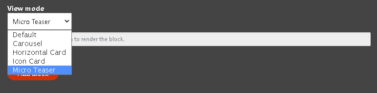
View Mode
Choose the View Mode of if you want something other than a square
- Carousel - Puts the cards in a single line, providing an arrow to navigate to the right if there are more than three cards.
- Horizontal - Elongates the view of the card
- Icon Card - Place the media on top of the headline and body text.
- Micro teaser - Best used in the 67-33% section layout and it should show an icon to the right of the truncated text.
Content Card Micro Teaser View
This is a content card with truncated text and a small image cropped to 50px by 50px. It works with content cards and reference cards. If it's a reference card it uses the media image and a custom text from the page node.
Create the Section
- Start by adding a new section and choose the two-column option.
- You can review this process here.
- Add a container and set it to full.
- Choose 67-33% on desktop and 100% on tablets and mobile.
- Then select the "Add section" button
Create the card
- When creating a card there are a few differences when inside a 67-33% section.
- Cards using a micro teaser view can only have one card.
- "Display Title" should be unchecked.
- Leave the "Card Background" set to none.
- you can choose to add a new card or choose an existing card.
- Some existing cards do not have the proper setup to display the image and truncated text properly.
- Once you have chosen your card select the micro teaser in the view mode drop-down.
- Lastly you can click add card.
Note: If you do not see text or an image on your card make sure to check the image and micro teaser fields on the referenced page.
New Card Example

Existing card example
Example Content Cards


Test Image
You can add information here about your photo, or you can add links to pages or documents within the card. These cards can be reused throughout the site.
Horizontal View


Test Image
You can add information here about your photo, or you can add links to pages or documents within the card. These cards can be reused throughout the site.
Carousel View
Test Image
You can add information here about your photo, or you can add links to pages or documents within the card. These cards can be reused throughout the site.

Test Image
You can add information here about your photo, or you can add links to pages or documents within the card. These cards can be reused throughout the site.
Content Cards 2 Column Max

Demo Card
This is for a large card that fills half the page. Mauris blandit aliquet elit, eget tincidunt nibh pulvinar a. Curabitur aliquet quam id dui posuere blandit. Sed porttitor lectus nibh. Vestibulum ac diam sit amet quam vehicula elementum sed sit amet dui. Vivamus suscipit tortor eget felis porttitor volutpat. Nulla quis lorem ut libero malesuada feugiat. Nulla quis lorem ut libero malesuada feugiat.
Content Cards Icon 3 columns Title Color Black
Content Cards 4 Columns Background Light Grey

Demo Card
This is for short text. Neque porro quisquam est qui dolorem ipsum quia dolor sit amet...

Demo Card
This is for short text. Neque porro quisquam est qui dolorem ipsum quia dolor sit amet...

Demo Card
This is for short text. Neque porro quisquam est qui dolorem ipsum quia dolor sit amet...

Demo Card
This is for short text. Neque porro quisquam est qui dolorem ipsum quia dolor sit amet...