The Component Layout or Custom Block system lets you dynamically create the content for each page or post. This powerful tool provides the organizational structure you need to create complex rich content and insures that the content is both styled and displayed correctly. This is important for both accessibility and for mobile responsive compatibility. The way the system works is based on the idea of a Custom Block Components. Each Block represents a unique layout or content component. You can add as many as you need for your content, and reorder/organize the blocks at any time. Components are added one at a time using the select list to build the content you want.
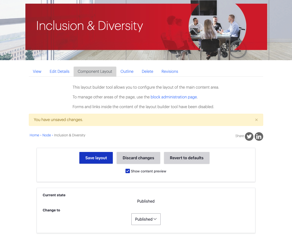

Component Layout Tab
To add content to a page, click on the "Component Layout" tab. When making any changes to this page, before you leave or "View" the page again you will need to click on "Save Layout".
If you want to make changes to an active page on the live site, consider changing the current status to "Draft" to preview changes prior to publishing them.
Latest Version Tab
Once you have clicked "Save Layout" in draft mode, a new tab will appear called "Latest Version" where you can preview changes you have made prior to publishing.
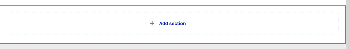
Layout Builder
Once you are ready to start adding content to your page, you'll scroll down and click "+Add Section". A window will open up to the right of the page where you will begin working with the Layout Builder to construct a new section for your page.
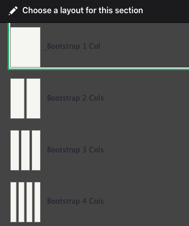
Then choose the number of columns you want for entering content onto your page, you have a choice between 1-12 columns to work with. This cannot be changed once selected. If you need to change a section you can create a new section with the required columns and then drag 'n drop the components from one section to the other. When you click the column you want you'll be taken to the section configuration.
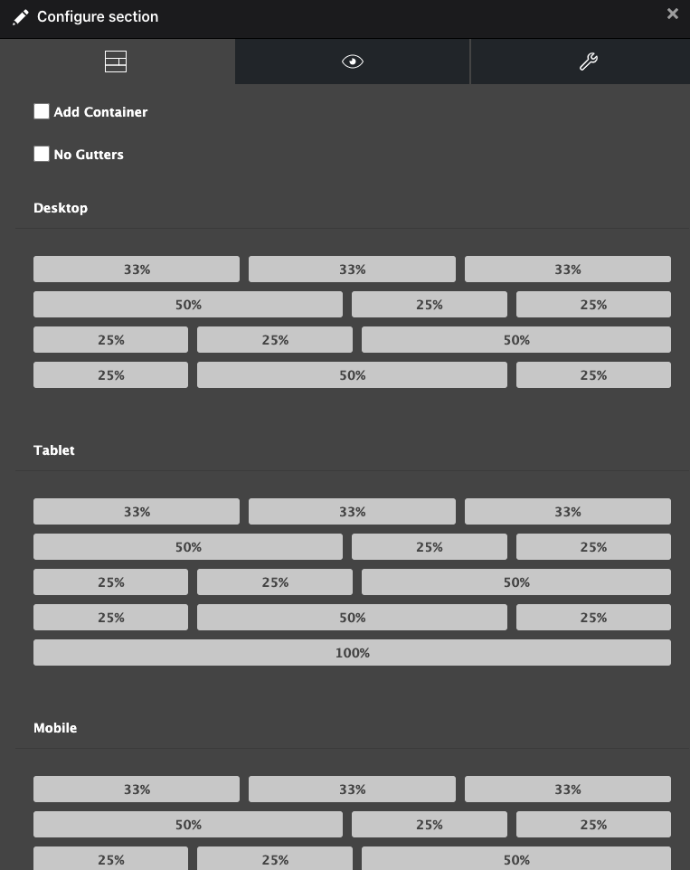
The section configuration controls layout, style and administrative settings for the section. The first tab is the Layout setting. This controls the left and right padding for the section, the specific column layout, and the left and right padding between the columns.
- Add container - generally this setting should always be checked. This sets the base column structure for the region and allows for left/right padding adjustments, background color adjustments and top/bottom padding adjustments.
- Section padding (Boxed/Full/Flush) - this controls the left/right padding on the entire column. Most content should use the Boxed setting as this places the content within the main content column using additional padding. However some content, like large number cards or background image will use the other settings. The Flush setting will remove all left/right padding from the column and push the content against the page container. (Not full browser window). The Full setting will remove the additional padding but keep the content within the main content column, this effectively halves the padding between the Boxed and Flush setting. Use that for content that should be just outside the main content column for emphasise.
- No Gutters - this checkbox will remove all left/right padding between the components within the column.
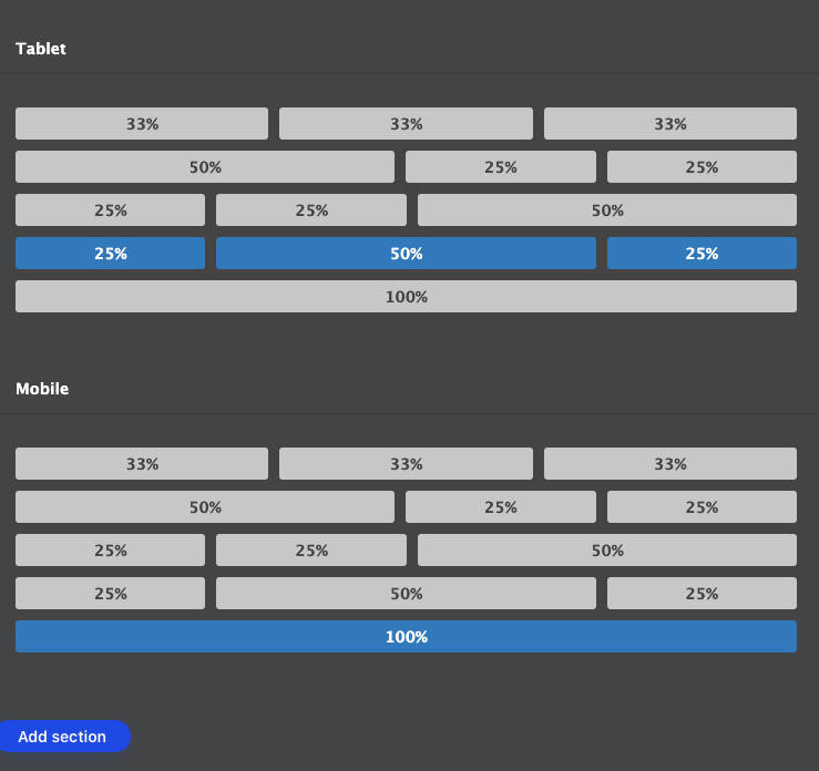
- Responsive Layout settings - the three Desktop, Tablet and Mobile settings controls how columns should look on each window size or device. It is important to always make these selections in order to properly control the layout for the section. The layouts are expressed in percentages of the section column; so a two column section with main content (text) on the left and sidebar (ctas, images) on the right would use a setting like 67% 33% for both Desktop and Tablet. Note that for the most part all content columns at mobile should use the 100% setting for best results. However, this is setting is not enforced so that 2 column icons or small images can be shown at mobile sizes.
A note on section columns and their controls. Explore the various options available for all the columns selections, however most content will use either the 100% or the 67% 33% settings. The 100% is useful for components like the Background Image, or Content Cards components. The 2 column layout should be used for the main content copy with sidebar call outs. On special column to be aware of is the 3 Column Hanging Chad. As indicated this is a 3 column section for layout, however its designed for only a 2 column layout for content. This allows for the 'hanging chad' content off the right side of the standard content column. This allows for images or big number cards to be half way overhung on the right side.
Section Styling
The second tab at the top of this screen takes you to a window where you can add style adjustments to the section as a whole. This includes changing the background color for the section, and choosing the top and bottom padding.
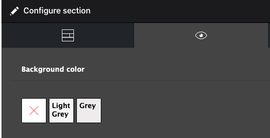
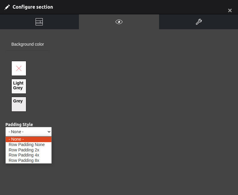
Background Color
The background color selection lets you choose between predefined colors for the entire section. This shows behind the content and does not override any colors for specific components. For instance if you place a Text Block component with the background color selected it will not override that. To disable any color select the red X selection.
Padding Style
This setting adds or removes the padding between this section and its neighbors. This only affects the top and bottom padding, not column padding. Note that this will also only affect the section the setting is on. So if one section has no padding and the next neighbor has 4x padding there will still be padding between those two.
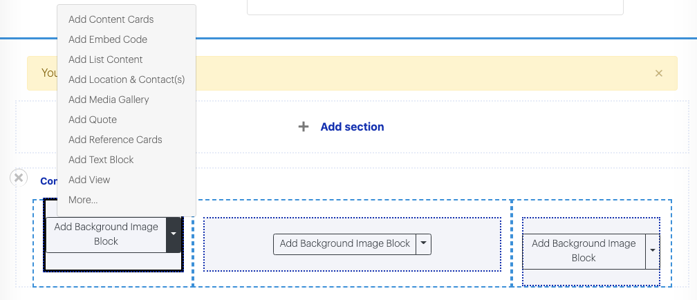
Adding Components
Once you have completed adding your new section, you can start choosing which components you would like to go into your layout. Below are a list of options with a brief description. If you ever need to go back in and reconfigure background color, or other aspects of this section, click on "Configure Section". If you decide you would like a text block to get moved into a larger section further down the page, you can go into the Component Layout tab and click and drag components into other sections. If you need to remove a section just click the X and confirm your deletion.
Background Image
Upload two images one sized for desktop, and the other sized for mobile per the instructions. Use the CKEditor to enter formatted text that will be shown on the Background Image, and choose whether to justify it left, right or center. This creates a full width image with overlaying text to use for visually highlighting key information.
Embed Code
This potentially dangerous Media item allows the placement of embed codes from external sources. For example, you can copy an embed code for specific Tweets on Twitter. Inserting that code(s) with this component will post it on your website, but it also has the potential for errors and issues on your web page.
List Content
Use this dynamic component to create lists of content that can be shown as full width ordered lists, accordions, or as tabbed groups. In each group you have the option to display Text, Number, or Image Items in various layouts and combinations.
Location and Contact(s)
With this component you can insert addresses or contact(s) information to blocks on your page with a background color or as stand alone. Once you have created an address/contacts block, you are able to reuse it anywhere on the site as opposed to having to re-type it on multiple times across different pages.
Media Gallery
The Media Gallery houses all media items that are used throughout the website including the following:
- Audio - MP3 files can be uploaded and used in whatever capacity you require.
- Document files - Multiple document types are allowed for upload and can displayed with the help of Content Cards or stand alone links.
- Images - These get used throughout the website on their own, in galleries, to provide a representative image for a referenced page, or in various component types.
- Remote video - YouTube or Vimeo share links can be captured as a reusable block item on various component types throughout the site.
- Podcasts - MUFG currently uses Podbean for their podcasts, and individual podcast links can be copied directly from their website for sharing throughout MUFGamericas.com
- Video - Upload MP4 files to the library as an alternative to the Remote Video option to be used to display as part of your content.
Adding a Media Gallery component to your page provides the flexibility of adding any of the above media items to a block.
Quote
Use this component any time you want to insert a quote on your page. Enter the quote text into the space provided and it will style & structure the content with quotation marks, attribution of who made the statement, the source for the statement, and the option to provide a URL reference for the source of the quote.
Reference Cards
If you want to invite visiting users to explore more pages of a certain topic, Reference Cards make it easy to insert cards that link to other pages on your website. The Our Locations page is a good example of this use case. Adding multiple Reference cards, each representing a country, allows visitors to see how many locations are spread across the globe, as well as providing links to explore each location in more detail.
To format your Reference Cards, make sure you upload appropriately sized photos to your pages' card image and card text fields in the "Edit Details" tab. Once this information is added, you will have a uniform card that can be used anywhere on the site.
Text Block
The component system allows you to shape and add text in any way you want to your page. If you want three columns of text in a section, choose to display three columns and then the percentage of the page each column should represent. Do you want to have a photo and then text alongside? Choose a two column layout, and create a Media Gallery block with Image, and a Text Block.
Remember to format your text properly by choosing Headings or Normal text and styles. Utilizing the CKEditor with all of its tools will make the text on your site clear and more accessible to screen readers.
View Component
The View Component allows you a way to insert a "View" of collected content onto your page. For instance, you could enter a block that pulls the most recent 10 Press Releases, or displays the last 10 Podcasts, maybe you want to have a block that shows the company's list of Press contacts organized by location. Views are a dynamic way to add blocks of content that are constantly changing and updating.
For a more in depth how-to on the components above, visit the respective pages in the handbook for further instruction on how to build out your content using these tools.